Application usage monitoring
Citrix Monitor helps you to monitor the usage of applications launched from the Citrix Workspace™ app session directly (also known as published applications)
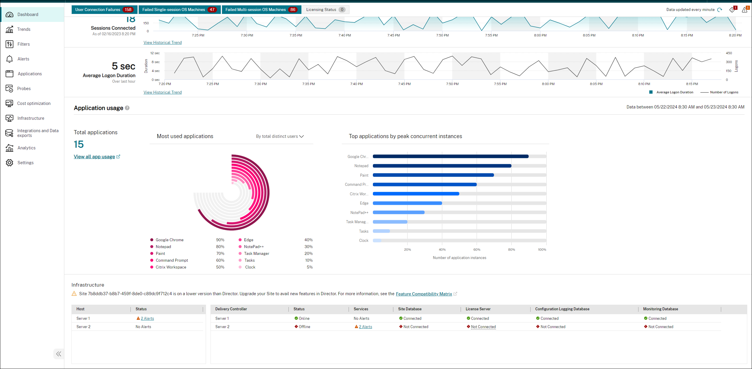
The application usage reporting provides visibility into the most, least, and not used applications. The most used applications are presented on the Dashboard and contain curated charts. These charts help the IT admins or application admins to gain insight into which applications are heavily used and the extent of their usage.
Note:
This feature is available only for the platinum-licensed sites.
With this feature, an admin can view which published applications are used the most. Using this data, admins can dive deeper into the extent of usage. Admin can analyze the details of the popular apps in the last 24 hours by the following data points:
- Total number of applications - Identifies the total number of applications in use by all the users in the enterprise’s site.
- Most used applications by total number of distinct users - Identifies the top 10 apps by the total number of unique users.
- Most used applications by total number of application launches - Identifies the top 10 apps based on the total number of application launches.
- Top peak concurrent app instances - Identifies the top 10 apps based on the highest number of simultaneous instances of each application’s usage. This information provides you the maximum demand for the applications listed.
This chart is present at the bottom of the Dashboard page. However, you can click Check it out on top of the screen to reach the chart directly.

You can also click View all app usage to view the details of a single app. This link opens the Trends > Capacity Management > Hosted Application Usage page.
The chart provides a visual representation of the app usage. Also, when you hover on the graph, you get the respective absolute counts of the selected data points. When you click any data point on the chart, the Trends > Capacity Management > Hosted Application Usage page opens with the specific app name selected. This data is to depict a comparative value against all the apps present in the enterprise’s system. The absolute value of the data point is also mentioned separately in the same hover.
Least used and not used apps report
In a large Citrix DaaS™ environment, it’s common to have many underutilized applications. To optimize your environment, the Applications page now offers extra metrics to help you understand application usage patterns within the organization and make data-driven decisions to improve resource allocation and cost savings.
Key features
- Detailed usage information: View distinct users (last 30 days), total launches, peak concurrent instances, and a trend chart of distinct users over time for each application.
- Data focus: Analyze application usage patterns over the last seven days, 30 days, or 90 days to assess application necessity. Viewing data for 90 days is recommended as it provides a quarter’s worth of data, allowing you to observe whether application usage fluctuates or remains consistent. The dates on the X-axis help correlate organizational events with usage trends to determine if a drop was expected. This data empowers administrators to maintain efficient environments by eliminating unnecessary applications.
- Optimization: Identify total published apps, least used apps, and unused apps to optimize your Citrix deployment.
- Actionable data: Make data-driven decisions aiding application management to optimize resource allocation and license management.
- Export data: Export data in PDF or CSV format for further analysis. You can also export the data using Power BI integration or ODATA queries using application usage.
Note:
C>urrently, only published apps (referred to as desktop apps in the Citrix Workspace app) are included in this enhancement.
Requirements
- VDAs version 7.15 or later
Viewing Application usage details
-
Click the View apps link in the Review least used apps section on the Dashboard.
Or,
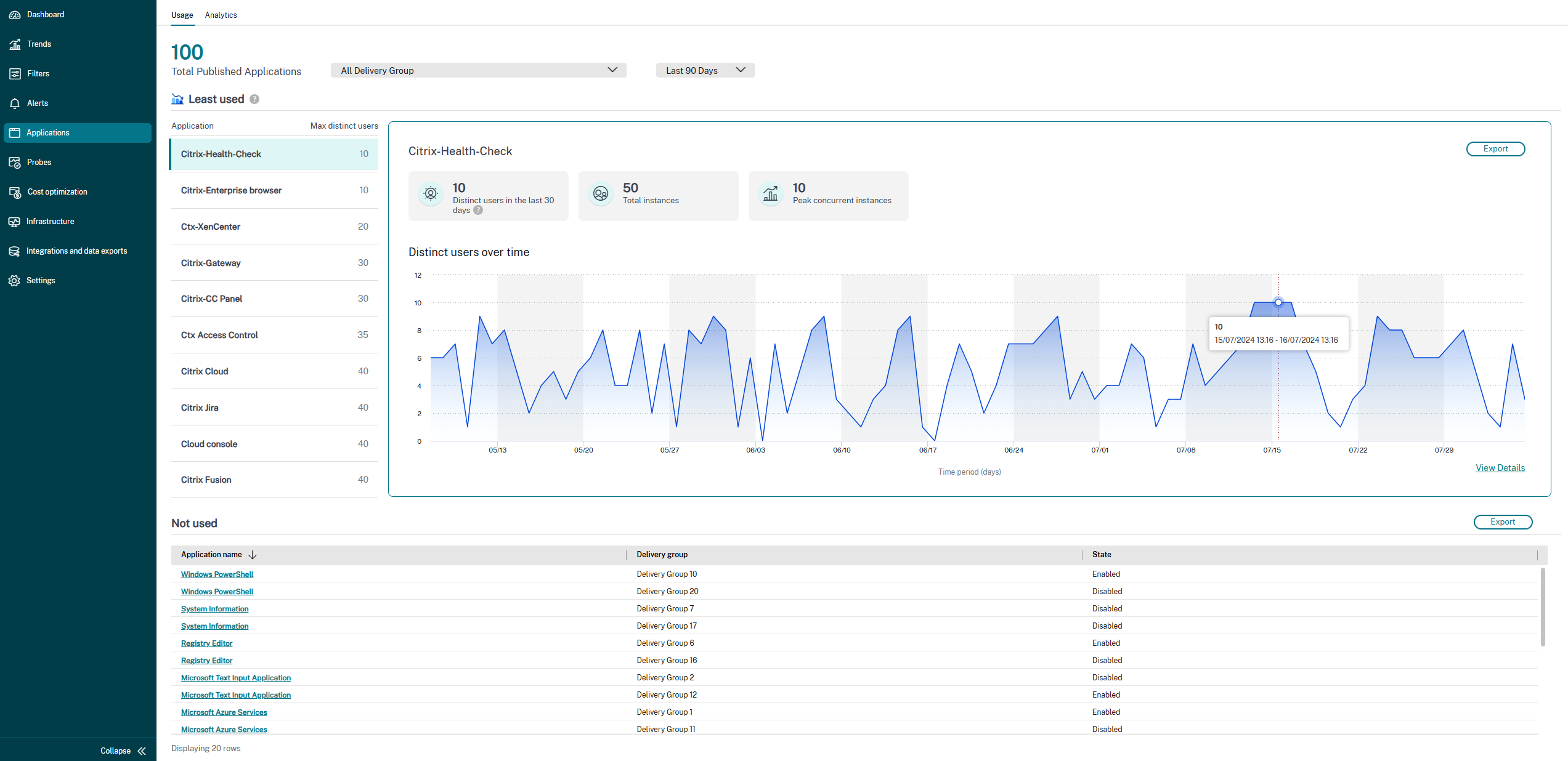
Click the Applications tab. The following page appears:

- Select the desired delivery group.
-
Select the required time period. (Note: For optimal analysis, the default is the last 90 days.)
The following information is displayed:
- Total published applications: Displays the total number of published applications.
-
Least used: Displays the apps with the fewest unique users over the selected time. The calculation is done as follows:
- Daily user count: The number of unique users for each app is counted daily.
- Peak daily usage: The highest daily user count for each app is identified.
- Highest overall Usage: The highest user count for each app across the selected timeframe is determined.
- Ascending order: The apps are listed in ascending order based on their highest overall user count, starting with the app with the lowest user count.
Note:
It is recommended to select the last 90 days as the period for analysis. This range of days provides a quarter’s worth of data and offers a comprehensive view of app usage patterns. However, options for filtering by seven days and one month are also available.
-
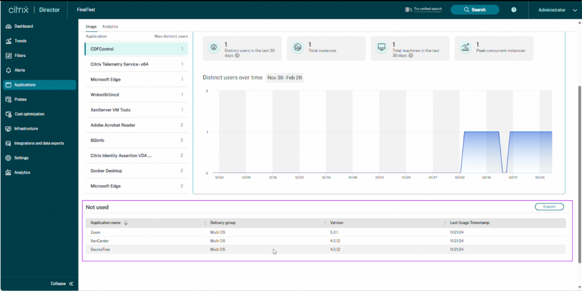
Not used: Displays the applications that you have not been launched a single time in the last 90 days are listed. The delivery group that they were delivered through, the version of the app, and the exact timestamp of its last usage are provided. This information helps admins make informed decisions before removing an application from a virtual desktop.

-
Select an app from the Least used category to view detailed usage information, including:
- Distinct users in the last 30 days: Displays the number of distinct users who accessed the app in the last 30 days. If you filter for seven days, this metric shows the distinct number of users for the selected app over those seven days.
Note:
Even when you select 90 days, this metric still displays data for the last 30 days only.
- Total launches: Shows the number of times the app was launched.
- Peak concurrent instances: Displays the highest number of instances running simultaneously.
- Trend chart: View a trend chart showing the number of distinct users over time for the selected app. Click View details to see more information in the Capacity Management > Hosted Application Usage section.
Usage of the trend chart
The trend chart illustrates the usage patterns, helping to identify trends and periods of low or high usage over the selected period. The X-axis represents the period in days, and the Y-axis represents the number of distinct users over time. By analyzing these metrics and the usage pattern graph, administrators can confidently optimize their Citrix DaaS environment.
You can use the trend chart in the following ways:
- Hover over data points: View the number of distinct users for the selected period.
- View trends: Identify usage patterns and determine whether app usage is consistent or just a temporary spike. This chart is useful for admins to monitor employee activity and identify potential issues or areas for improvement. For example, if an employee goes on vacation, there might be no application usage during that period. Once the employee returns, the application usage increases. The default filter for the period is 90 days that assists admins in making these calculations.
- View details: See the date and the corresponding number of distinct users.
- Filter options: Select different Time Period filter options to view the corresponding data.