Cost optimization
Citrix Monitor now introduces a new feature called Cost Optimization, which helps you to analyze the usage of virtual machines and sessions effectively. This feature provides insightful visual representations on how to optimize the cost. It also helps you to eliminate unnecessary machines and thereby reducing costs.
To support the cost optimization, the following alerts are also introduced:
You can also inspect machines with recent power actions to analyze power-on failure which causes user issues and power off failure which increase costs. For more information, see the Inspect machines with recent power actions section.
Click the Cost Optimization tab from the left menu on the Home page to access the Cost Optimization page.
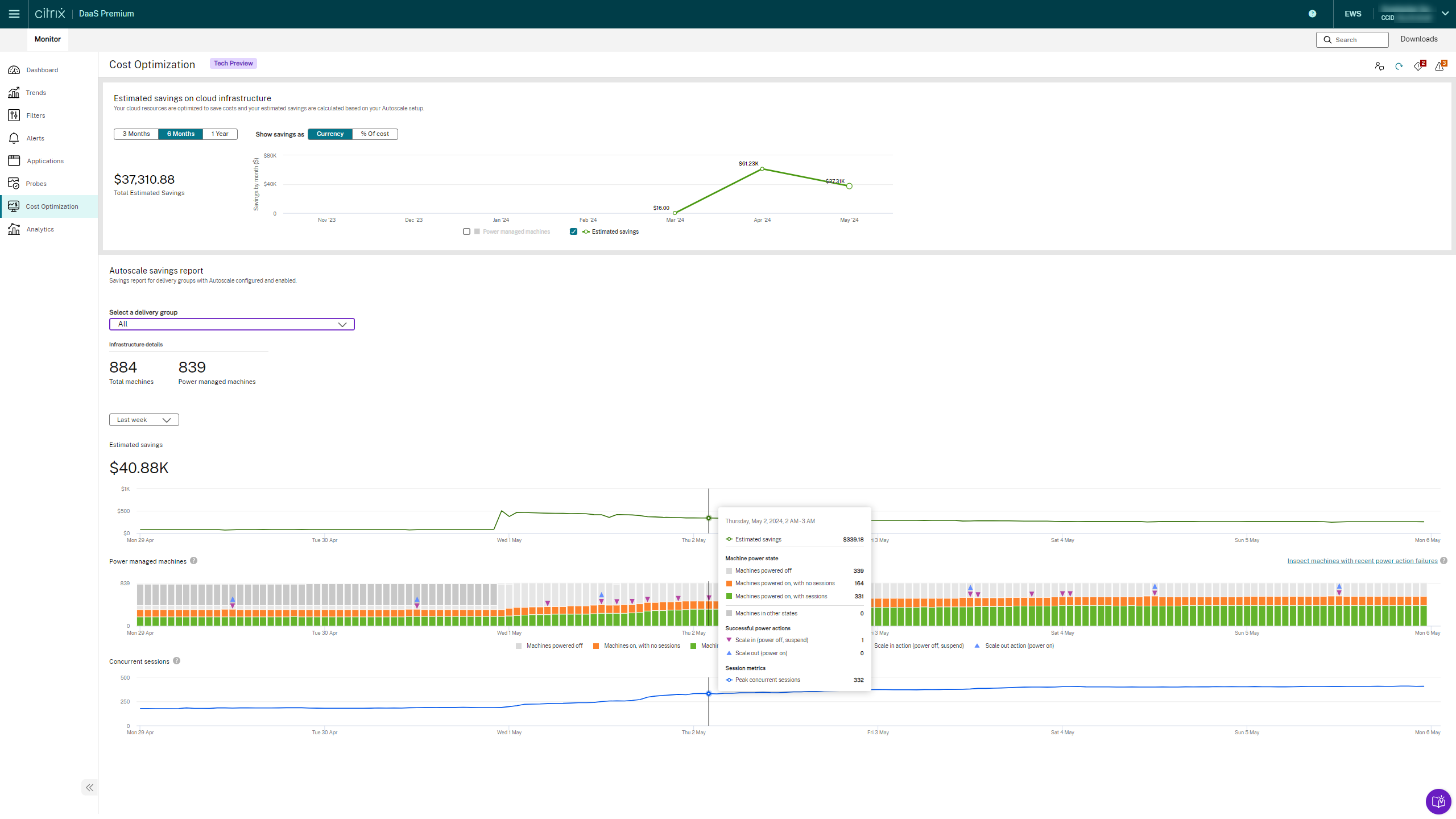
On the Cost Optimization home page, you can do the following:
- Get started link - Access this link to learn more about the cost optimization feature.
- Review the cost optimization page - You can provide feedback on the Cost Optimization page
- Refresh the data.
- View the alerts - You can view both critical and warning alerts.
- Export data
The Cost Optimization page includes the following features:
How is the cost calculated for cost optimization
The cost per machine per hour is displayed in the currency that the hypervisor supports. This section describes how cost is calculated for Azure machines and for other machines.
Cost for Azure machines
The order of priority for calculating the cost is as follows:
-
When the ‘Microsoft.Consumption/pricesheets/read permission is available, the effective price is displayed in the currency that is configured in the Azure subscription. This method to calculate cost is in preview.
-
If permissions aren’t available, the Azure retail price is displayed. For more information, see Azure Retail Prices overview.
Note:
Make sure you have access to the
https://prices.azure.comendpoint to enable retrieval of either the effective price or the retail price details. - When the effective price or retail price isn’t available, the cost is displayed based on the cost entered by admins in the Web Studio. For more information, see Machine cost section of the documentation.
- If there’s no cost mentioned in the Web Studio, the default cost of $1 is considered.
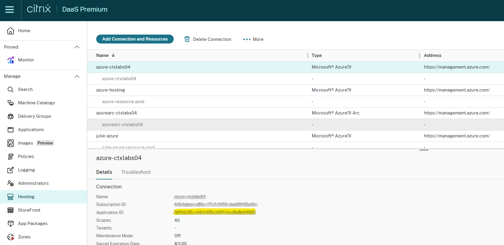
To find the account details of Azure and add the required permission to find the effective price, do the following:
- Navigate to Citrix DaaS.
- Click the Hosting tab to find the hosting connection account.
-
Look for the Application ID mentioned in the Hosting tab.
- Go to the Microsoft Entra ID and look for the Application ID noted in step 3.
-
Go to Subscription > Access control (IAM) > choose a customized role configured for the hosting connection SPN.
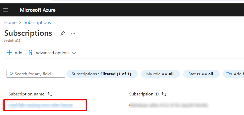

- Add the Microsoft.Consumption/pricesheets/read permission to the role.
How to verify the Azure retail price
If the Microsoft.Consumption/pricesheets/read isn’t available, the Azure retail price is displayed. Now you can use the Retail Rates Prices API to get retail prices for all Azure services. Previously, the only way that you can retrieve prices for Azure services was to either use the Azure Pricing Calculator or use the Azure portal. For more information, see Azure Retail Prices overview.
Calculating costs for machines other than Azure
For other machines, cost is displayed based on the cost entered by admins in the Web Studio. If there is no cost mentioned in the Web Studio, the default cost of $1 is considered.
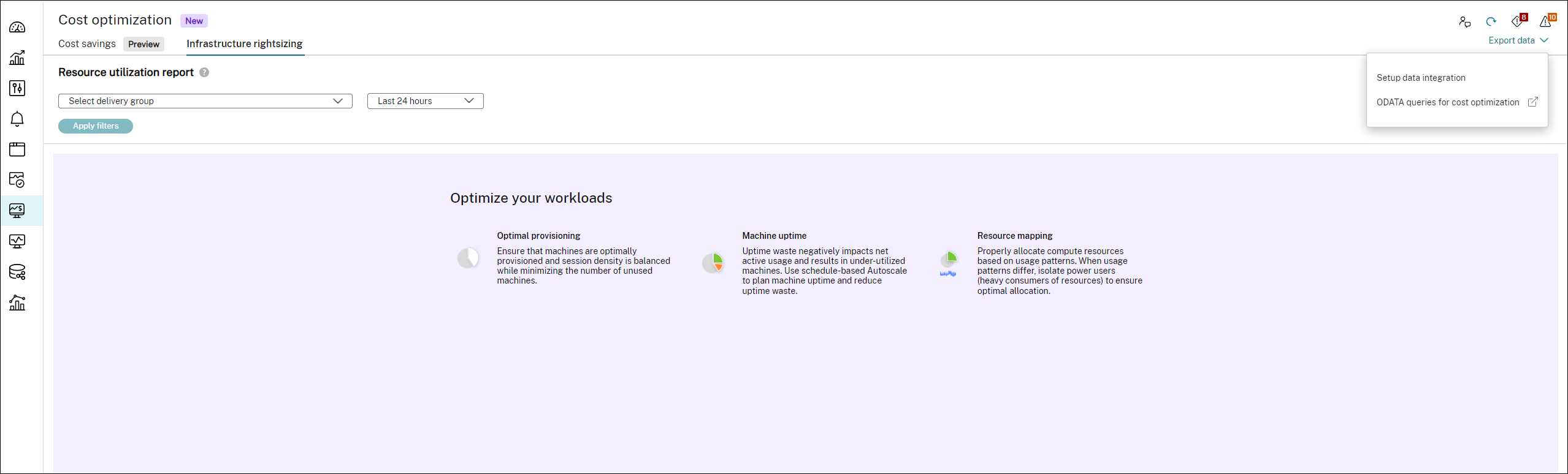
Export data
You can export the data on the Cost optimization page using data integration and ODATA queries. To export data, click Export data on the Cost optimization page, the following options are displayed:
- Setup data integration
- ODATA queries for cost optimization
Setup data integration
You can integrate Cost optimization data with the Monitor Service API using which you can collect the data for troubleshooting and triaging the issues. For more information, see Integrations and data exports page.
ODATA queries for cost optimization
You can use the available sample ODATA queries on the Cost optimization page to export data.
Get started with ODATA
The following links help you to start using ODATA:
- Overview on ODATA
- Different methods to access Citrix Monitor Service data using the OData v4 endpoint in Citrix Cloud
- Use OData V4 aggregation queries in Citrix Monitor Service data
- How to connect PowerBI with DaaS Monitor using OData and API clients
- Get details of users with high logon duration using Postman
- How to Access the Monitor Service Data
- Data Access Protocol
Sample ODATA queries
Find out unused VDA
To find out an unused VDA, you must provide a desktop group ID, start date, and end date of the VDA.
For more information to reduce spending on the unused resources, see Workload rightsizing.
Sample query:
https://api-us.cloud.com/monitorodata/ResourceUtilizationSummary?$apply=filter(DesktopGroupId eq desktop-group-id and granularity eq 1440 and SummaryDate ge startdate and SummaryDate lt enddate)/groupby((MachineId), aggregate(cast(TotalSessionCount, Edm.Int32) with average as AvgTotalSessionCount))/filter(AvgTotalSessionCount eq 0.0)/aggregate($count as UnusedVDACount)
<!--NeedCopy-->
Find out the daily average uptime in minutes
To find out the daily average uptime in minutes, you must provide the following:
- Desktop group ID
- Start date
- End date
- Day difference between the end date and start date.
For more information to reduce spending on the unused resources, see Workload rightsizing.
Sample query:
https://api-us.cloud.com/monitorodata/ResourceUtilizationSummary?$apply=filter(desktopGroupId eq desktop-group-id and granularity eq 1440 and SummaryDate ge startdate and SummaryDate lt enddate)/groupby((MachineId), aggregate(cast(UptimeInMinutes, Edm.Int32) div day-difference with sum as TotalUptimeInMinutes))/aggregate(TotalUptimeInMinutes with average as DailyAverageUptimeInMinutes)
<!--NeedCopy-->
Find out failed machine power action
For more information on failed machine power action, see Failed power on action and Failed Power off action.
Sample query:
https://api-us.cloud.com/monitorodata/Machines?$filter=LifecycleState eq 0 and DesktopGroup/SessionSupport eq 1 and (cast(LastPowerActionReason,'Edm.Int32') eq 6 or cast(LastPowerActionReason,'Edm.Int32') eq 7 or cast(LastPowerActionReason,'Edm.Int32') eq 8) and (cast(LastPowerActionFailureReason,'Edm.Int32') eq 300 or cast(LastPowerActionFailureReason,'Edm.Int32') eq 402 or cast(LastPowerActionFailureReason,'Edm.Int32') eq 401) and MachineRole eq 0&$orderby=Name&$skip=0&$top=50&$expand=DesktopGroup($select=Name)&$select=Sid,Id,Name,IsAssigned,IPAddress,FaultState,LastDeregisteredCode,FailureDate,CurrentPowerState,CurrentSessionCount,IsInMaintenanceMode,LastPowerActionFailureReason,LastPowerActionCompletedDate
<!--NeedCopy-->
Find out total savings
For more information on cost savings, see the Cost savings page.
Sample query:
https://api.cloud.com/monitorodata/MachineCostSavingsSummaries?$apply=aggregate(TotalAmountSaved with sum as TotalAmountSavedSum)
<!--NeedCopy-->
Find out the machine state
For more information on cost savings, see the Cost savings page.
Sample query:
https://api.cloud.com/monitorodata/MachineCostSavingsSummaries?$filter=SummaryDate eq 2024-08-09T06:00:00Z&$select=TotalMachinesCount,PowerManagedMachinesOff,PowerManagedMachinesInHibernate,PowerManagedMachinesOnWithSessions,PowerManagedMachinesOnWithoutSessions
<!--NeedCopy-->